How to create a cover for your game or book
The subtle art of making do
So, I finally found the time to write this tutorial. I hope it will be useful to all those who (like me) are not illustrators but don't always have a good budget to pay a real artist. If you have the budget, rely on a real illustrator: their work will help you create something unique and personal.
This tutorial could be helpful even after you have commissioned an illustration to which you want to make changes. So, let's get started.
Goal
Find a way to use some stock images that you can buy for a few bucks in one of the various online stores to create a new illustration capable of transmitting the atmosphere of your game or book.
For the tutorial, we will analyze the cover I made for Doomfire, one of the games I am working on.
The Idea
First of all, you have to know what you want to achieve. The kind of atmosphere and the “core” of your cover. A place? A character? A symbol?
For Doomfire, I wanted something that reminded me of the Doom cover but set in a fantasy world.
I usually do a bullet point like this:
Hero wielding a weapon
Undead hordes
Fire
Dark atmosphere
Find the right illustrations
This is the trickiest point. It's essential to find illustrations that can work for what you want to achieve. Focus on one or two elements per illustration.
For Doomfire, I took these four:
First Illustration
Link: An eclipse of the yellow sun in a hot sky in the middle of the crazy ruins of hell.
In this one, I liked the eclipse in the background (very much like “Berserk” or “Dark Souls”).
Second Illustration
Link: A furious black dragon destroys the army of the undead with a fiery breath.
Here I wanted to use the fiery skulls in the foreground.
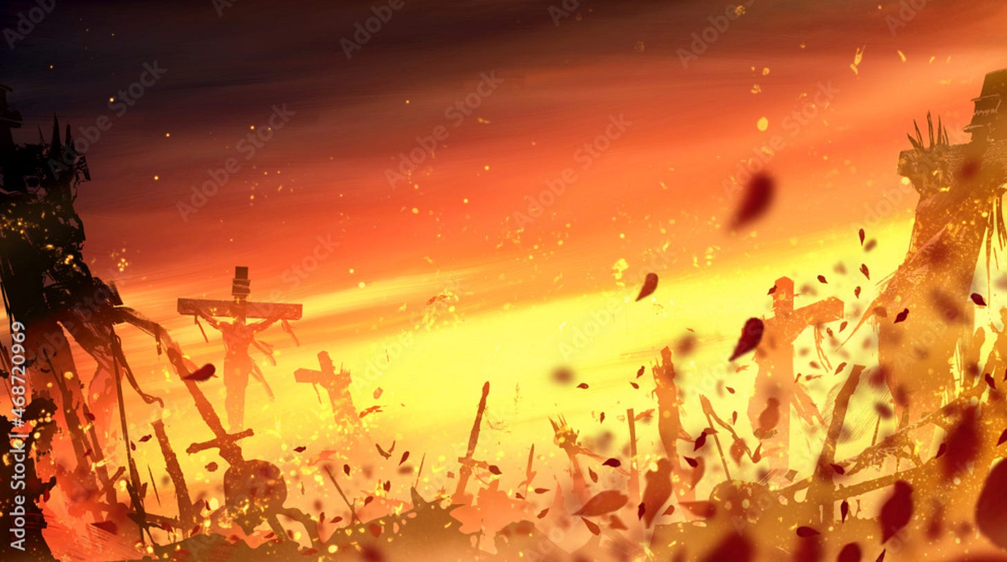
Third Illustration
Link: The battlefield is in a bright yellow-orange sunset.
A perfect background: the scenery, with the crosses, the deads, and the dark atmosphere.
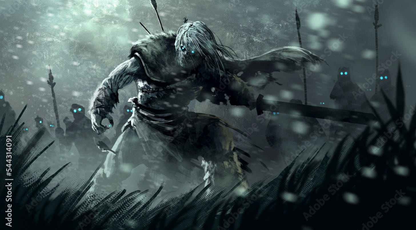
Fourth Illustration
Link: An undead warrior with a sword leads an army of the dead.
This was the kind of main character I was looking for. This illustration has a very different color scheme than the previous ones, but as we will see, this is not a real problem.
Putting the Images together
To mix the images, we will need to use photo editing software. I use Adobe Photoshop, but Affinity Photo is also a good editor for this type of work.
Step 1: Background
Choose the illustration that will be the background and insert it into a file of the desired size.
In my case, the background will be the third illustration, and the image size is 2550x1800 pixels (it's a strange aspect ratio, but for Doomfire, I decided to use a somewhat horizontal format - obviously, this aspect depends on what kind of cover you need).
Step 2: Midground
Insert the illustration with the details a little closer to the background and insert it on a higher layer.
Then, use the mask tool to hide everything you don't want to keep. In my case, illustration number 1, from which I only kept the eclipse.
Guide: how to use masks.
Hint: you can use the brush tool to apply a mask so its edges are “soft.” With the black color, you will hide the elements. With the white color, instead, you will bring them back.
Step 3: Key Layer
Insert the illustration with the central and most essential elements of your cover.
Again, use the mask tool to hide the parts you are not interested in. In my case, I extracted the character and the foreground grass from illustration four.
Step 3b: Change Color
Of course, we must ensure that the character is the same color as the rest of the illustration.
Use the match color tool that you can find in the menu:
Image → Adjustments → Match Color
Use one of the other illustrations of the correct color as a reference (in my case, I used the background illustration).
Guide: how to use match color.
Step 3c: Brightness and Contrast
If you notice that the lighting and contrast levels are slightly different between the layer where you applied the match color and the rest, you can fix them using the dedicated tool.
Select the layer you want to adjust.
From the menu Select → All.
From menu Image → Adjustments → Brightness and Contrast.
Adjust the values until you are satisfied.
Guide: how to use Brightness and Contrast.
Step 4: Foreground
Choose the illustration with the foreground elements you want to use.
Again, remember to apply a mask to hide the elements you are not interested in. In my case, illustration two is the one from which I used the elements of the fiery skulls in the foreground.
Final Step: Polishing and Special Effects
If you want to give the illustration a final touch, you can add layers with light or dirt effects on top of everything.
In my case, I added a light vignette around the edges of the illustration and a transparent layer with sparks and embers.
Final Considerations
I hope the tutorial was interesting and can be helpful in your projects. If you think it will be useful for other people, feel free to share it!
I'm unsure when I will publish the next tutorial or game design article, so if you are interested, subscribe to this mailing list.
If you want to ask questions, you can find me on Bluesky.
If you want to see the games I've published so far, you can find them on itch.io .


Cool guide!
Ciao, I found only today this great post! Congrats for your very impressive outcome and, needless to say, for your skills in this field! Just a question: is that your hobby or is it your job? Thanks and ciaoo